texas burlesque festival
re-branding, art-direction, illustration
Published Silver award in 2019 Graphis new talent annual
awarded aiga flux honorable mention
problem
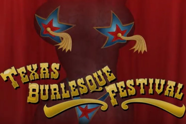
burlesque has a rich history, and has changed drastically through time into a quirky art-form, often misunderstood. the current brand is cartoonish, causing the brand to appear kitschy rather than robust.
solution
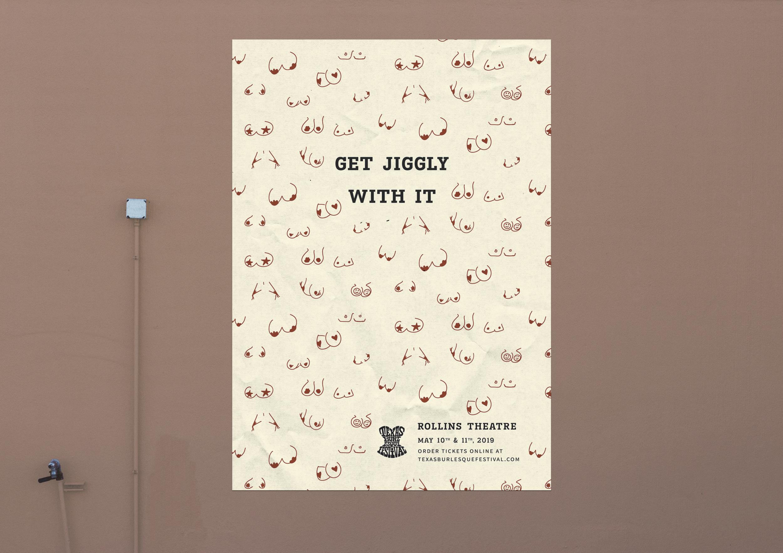
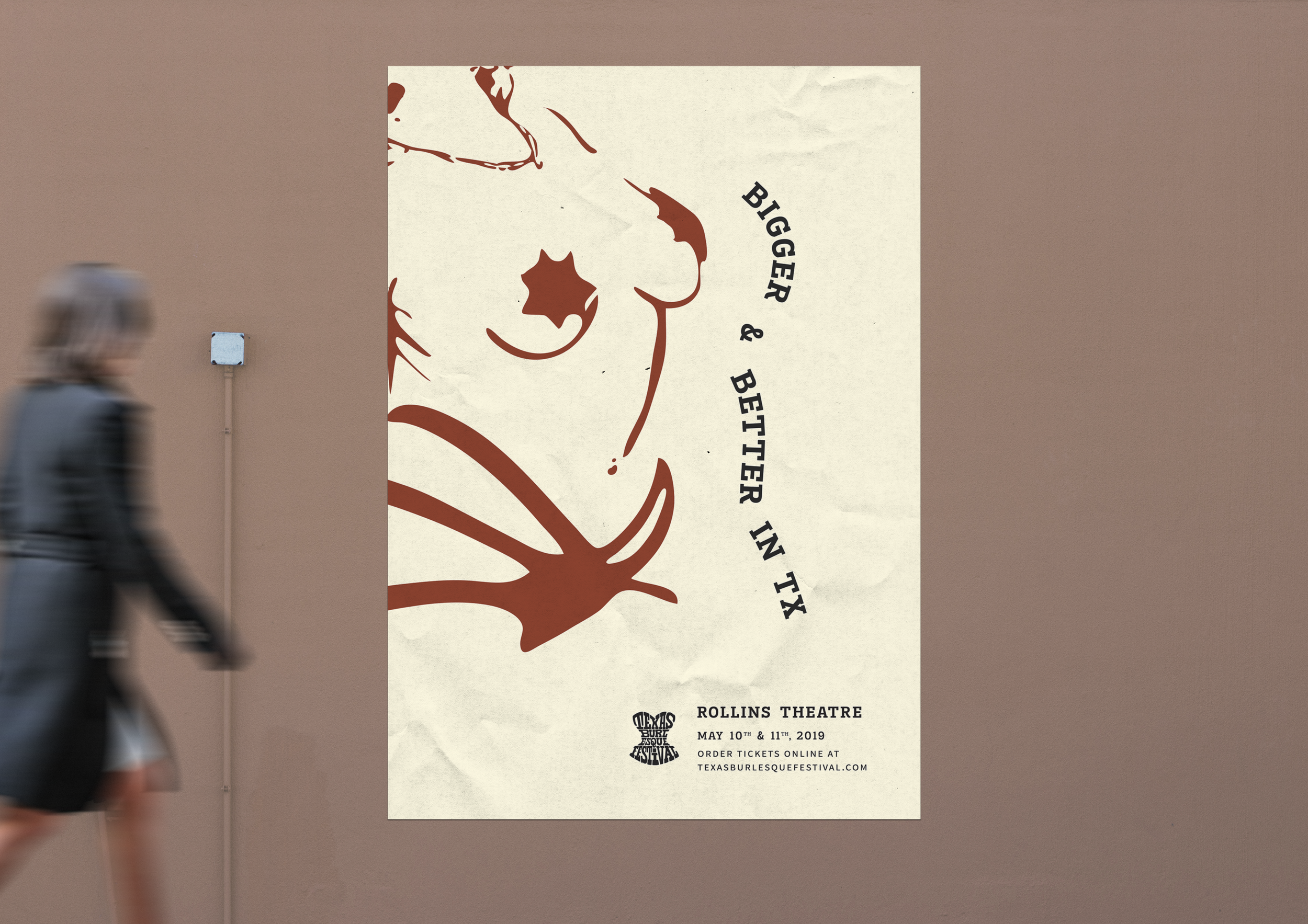
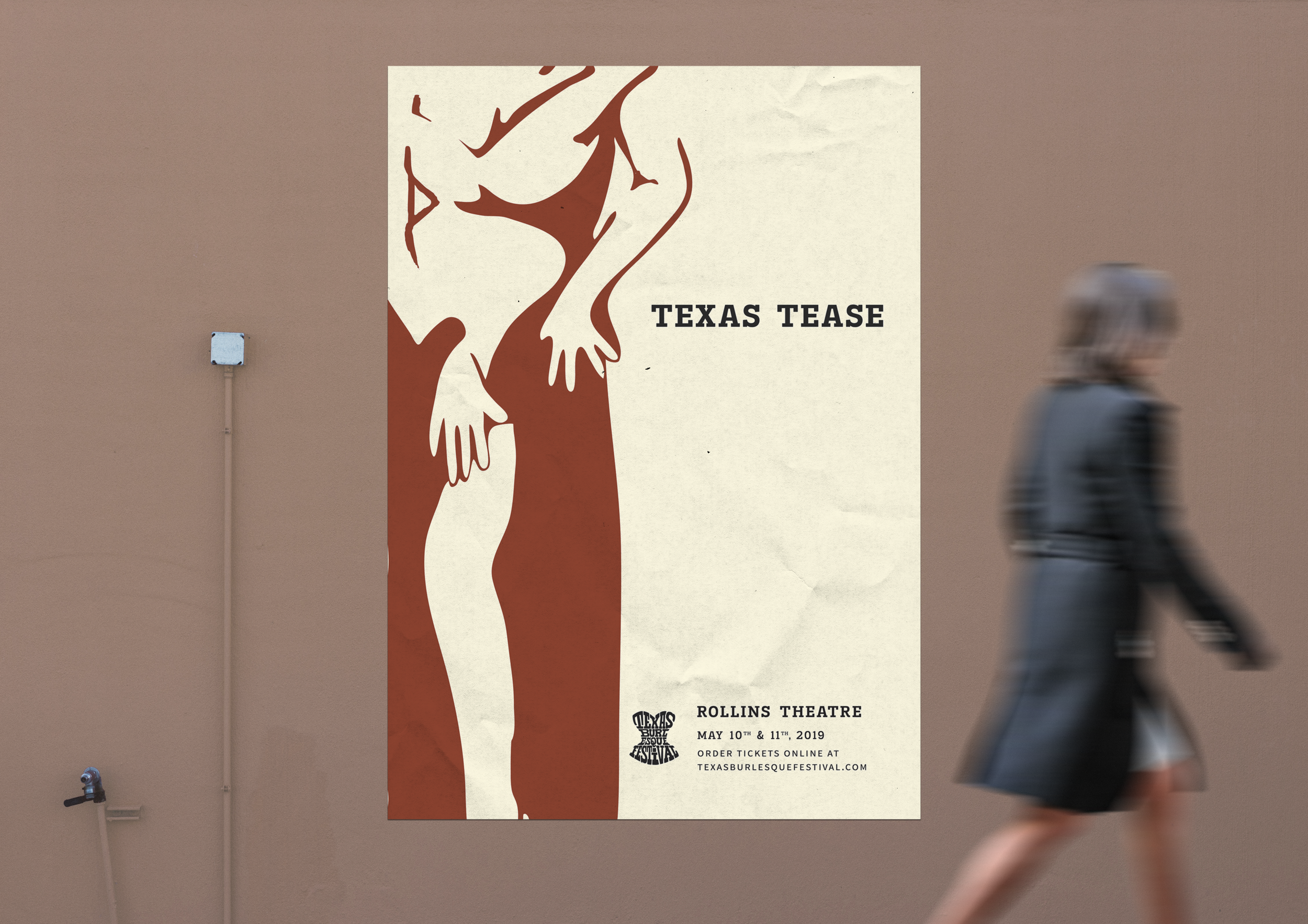
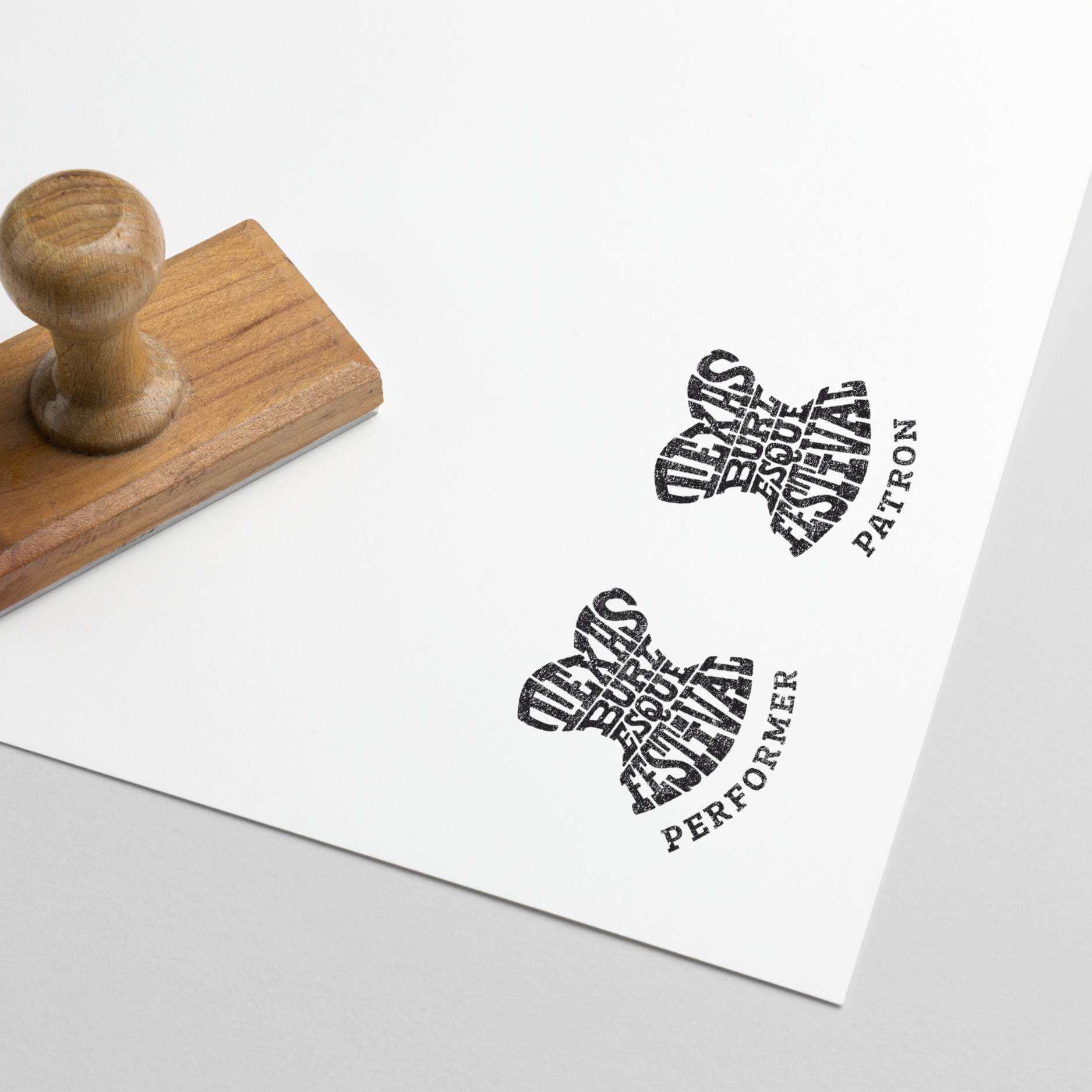
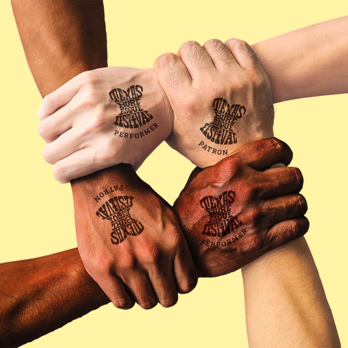
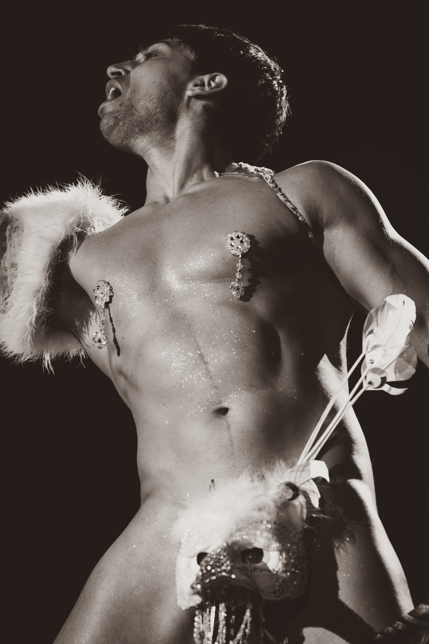
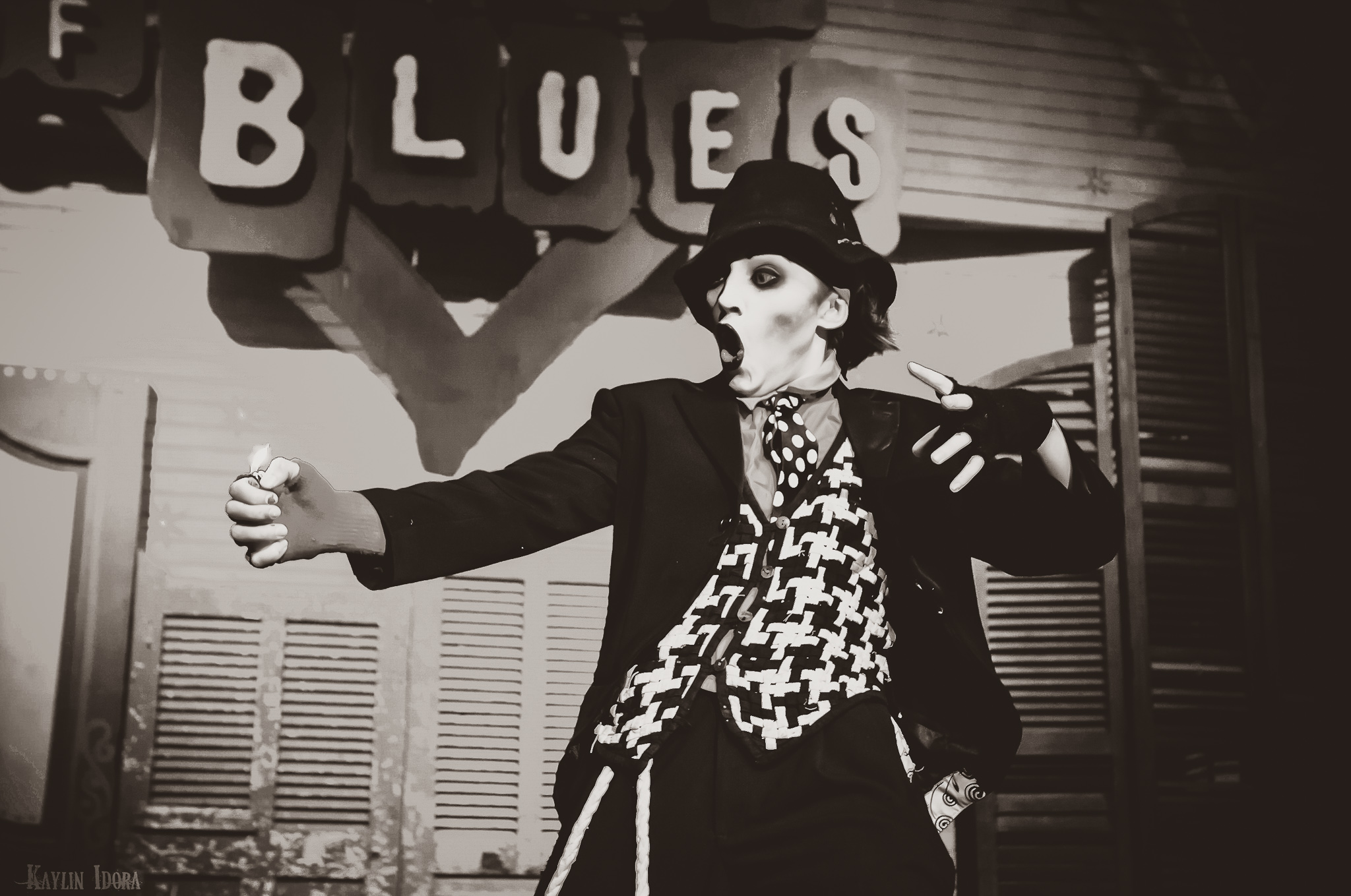
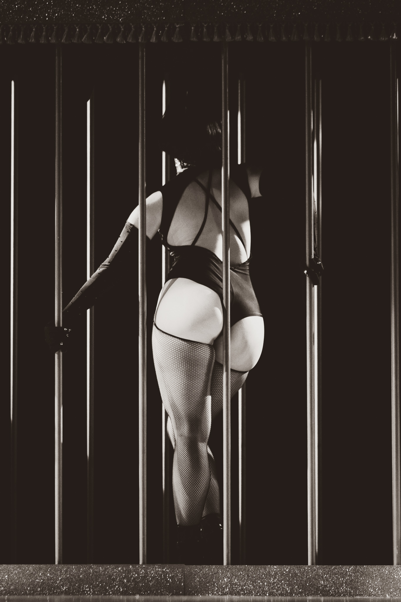
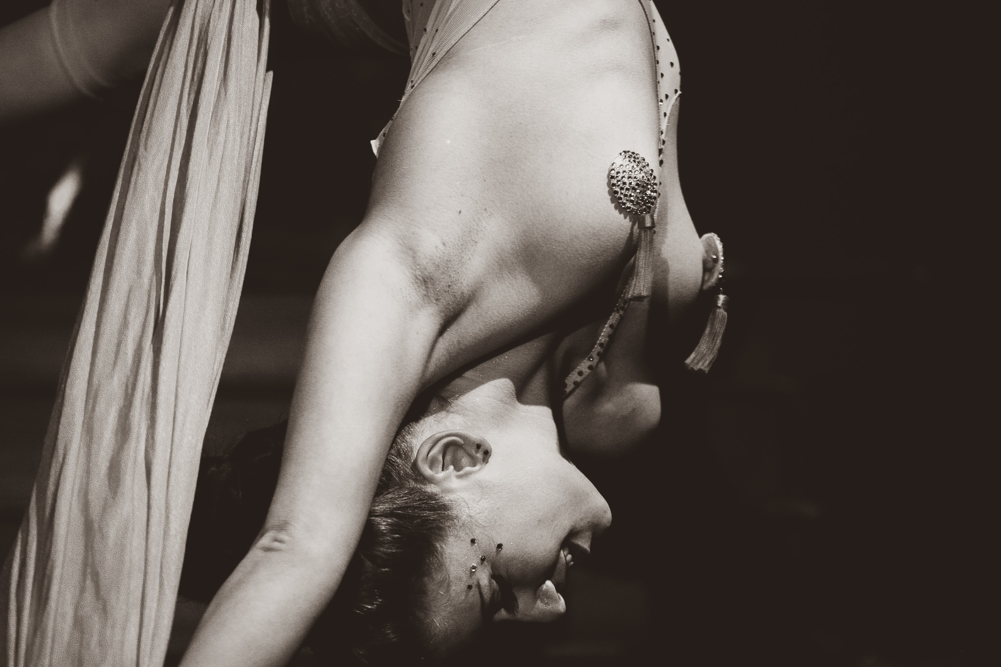
Inspired by letterpress and vintage photo treatments (imagery), the brand is directed back to its roots with a few modern twists. classic forms pulled into modern applications.
color palette
typography
headline
body copy
brand voice
bold and unapologetic, our brand voice remains informative while remaining playful and fun. consider us to be your quirky aunt, available to lead you safely through the fringes; hoping to enlighten you to the inappropriate things your parents never will.
audience
voyeurs: young people of legal drinking age seeking a new nightlife social scene.
performers: we are a global community open and welcoming the best modern burlesque entertainers to perform and teach
illustration styles
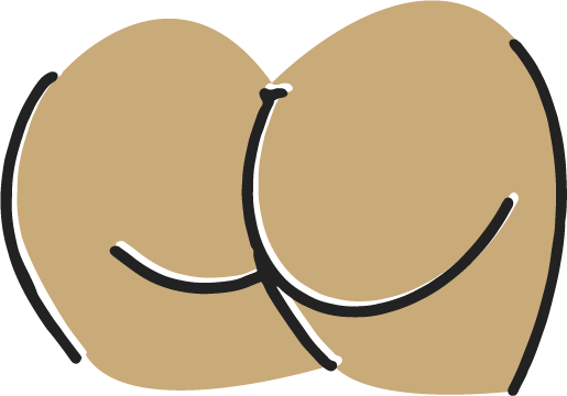
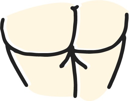
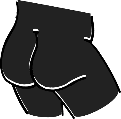
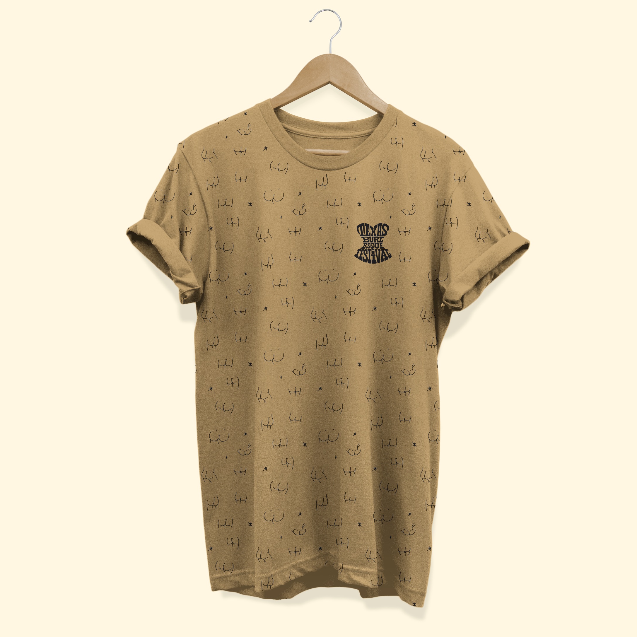
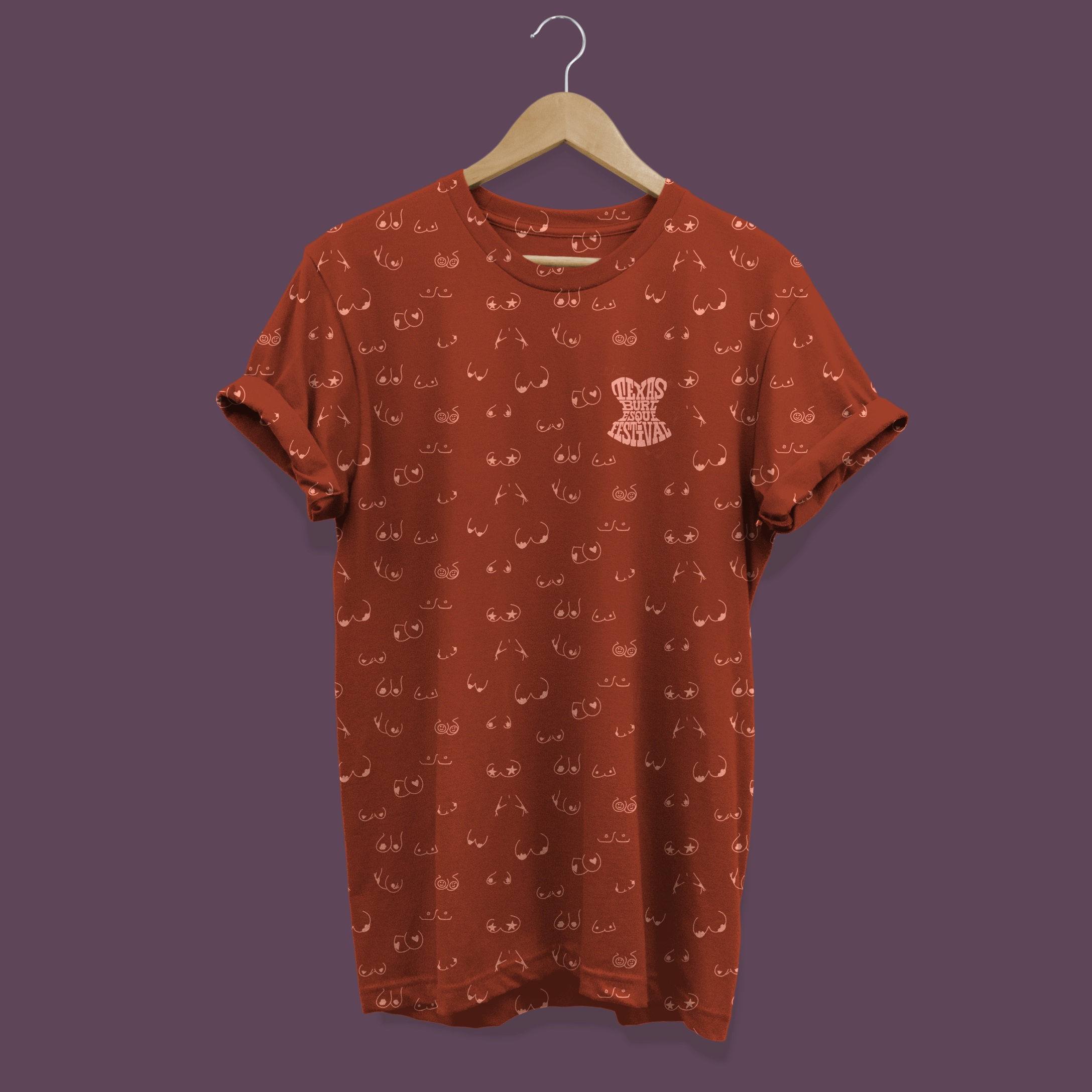
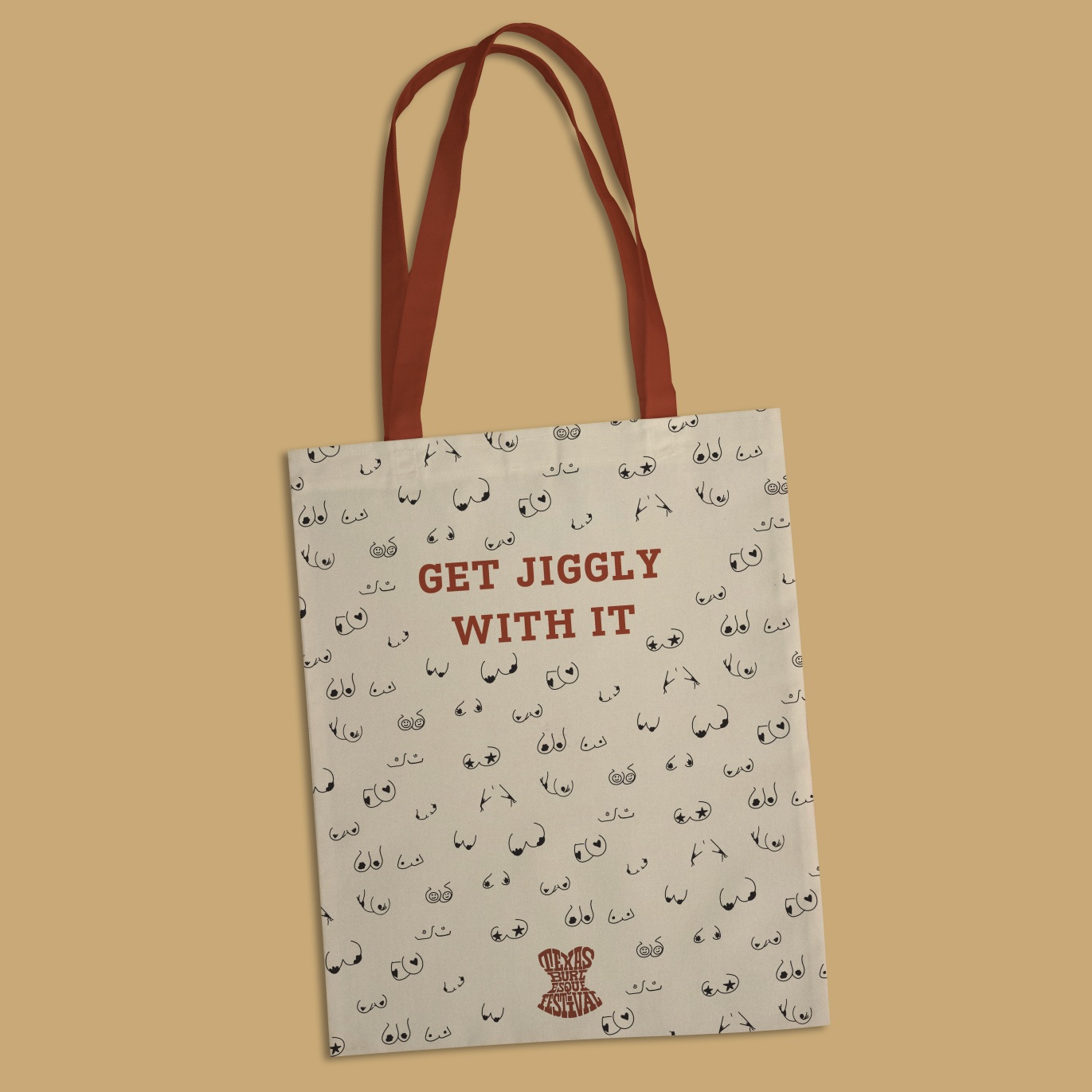
as our media presence is public, nudity is alluded to in the abstract. we want you to assume it happens but not offend the average joe.
photo styles
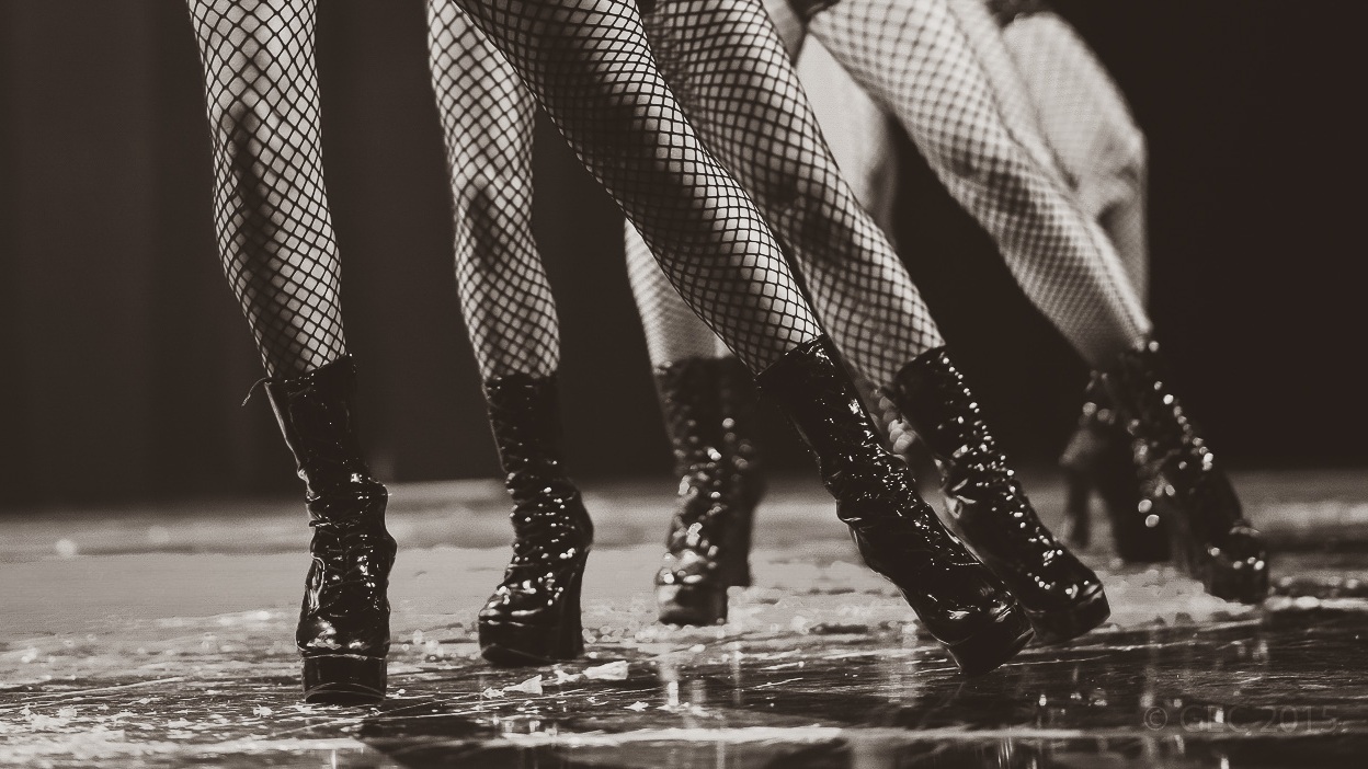
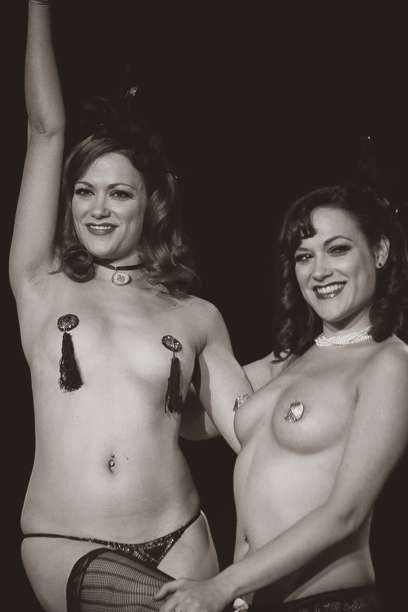
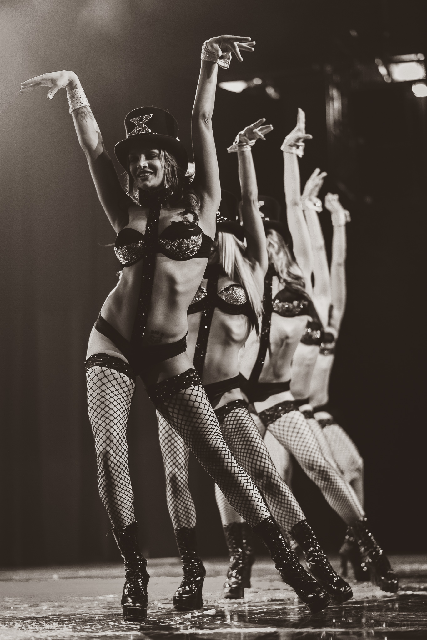
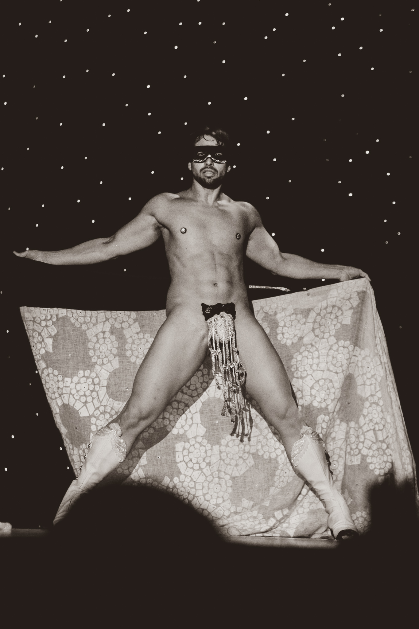
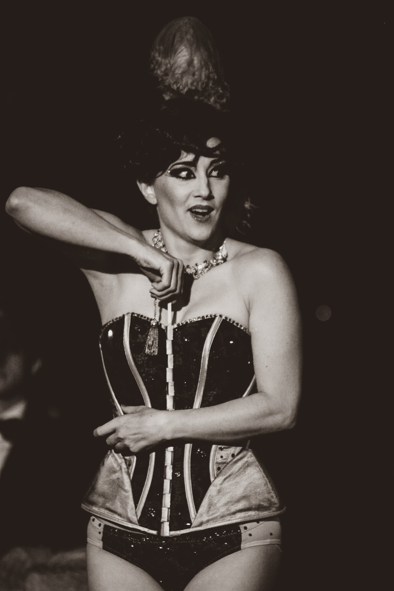
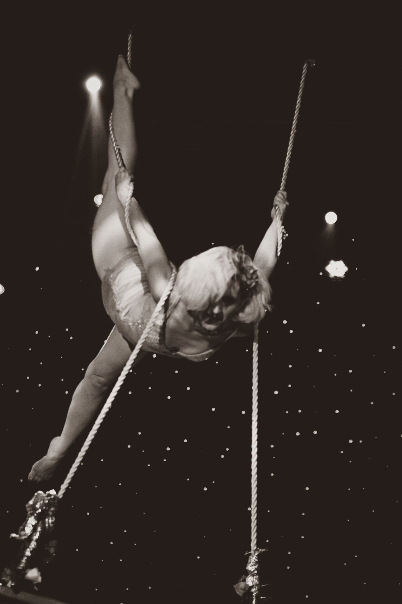
vintage black and white hardline chrome. the focus is on our amazing performers —the people—not their clothes (or lack thereof).
credits:
illustrations: me, photography: wiki commons


